Ope! App Design
End to end design for iOS app created to improve hiking experiences for people with dogs.
Home Screen Widget - Light Mode
I partnered with a developer to create an end-to-end app design that solves a problem he experiences - dealing with dog waste while hiking. I utilized the entire UX Design process to make this app with him.
Problem
The stakeholder wanted a way to track where he places his dog’s waste bags on a trail so he can spend more time enjoying nature and less time handling waste.
Solution
We created an app that allows people to drop a pin to indicate waste location from a widget on their lock screen and in the app. On the hike back, they can find the dropped bag(s) via the map and receive notifications when they’re close to a bag.
Tools
Figma
Maze
Team
UX Designer
Software Engineer
Timeline
My Role
Overall: 10+ weeks
Discovery & Research: 2+ weeks
Design & testing: 8 weeks
UX Design
UX Research
Research
Interviews
I prepared an interview script with 17 open-ended questions, focusing on our target audience’s habits and priorities while out with their dogs. I recruited and interviewed five users remotely.
People love being outside with their dogs, and they either carry the waste bag with them or set it in a discrete location to be picked up later.
“Hiking with a smelly waste bag has definitely negatively impacted us and the people around us.”
“We’re always carrying poop around with us or trying to hide it in a memorable place near the trail…”
User Interview Insights
“We’re always carrying poop around with us or trying to hide it in a memorable place near the trail and always looking for trash bins.”
“Hiking with a smelly waste bag has definitely negatively impacted us and the people around us.”
“Spending time outside nourishes his mental stimulation.”
“We hike 5-15 miles every weekend so dealing with waste is a big chore.”
“When we’re hiking on leash, it’s picked up and either set to the side of the trail or carried. If hiking off leash and he’s far off the trail, it’s left there.”
“We love hiking because it gives us a chance to practice off leash training.”
Design
Information Architecture
I created a site map and task flow to identify app structure and opportunities for simplified user flows.
When reviewing the site map, the stakeholder and I identified four unnecessary MVP features and taps while moving around the app. Eliminating these from the new design resulted in a much more efficient app structure and better user experience.
Original Site Map
Revised Site Map
UI Kit
The plan was to make this app feel minimalistic, playful, and subtle. We also decided on the following:
Dark and light mode colors chosen from Apple system colors in a monochromatic scheme
Simple and easy-to-identify logo created in Figma
Playful representation of the app name
Organized and delivered in Figma
UI Kit
Low Fidelity Wireframes
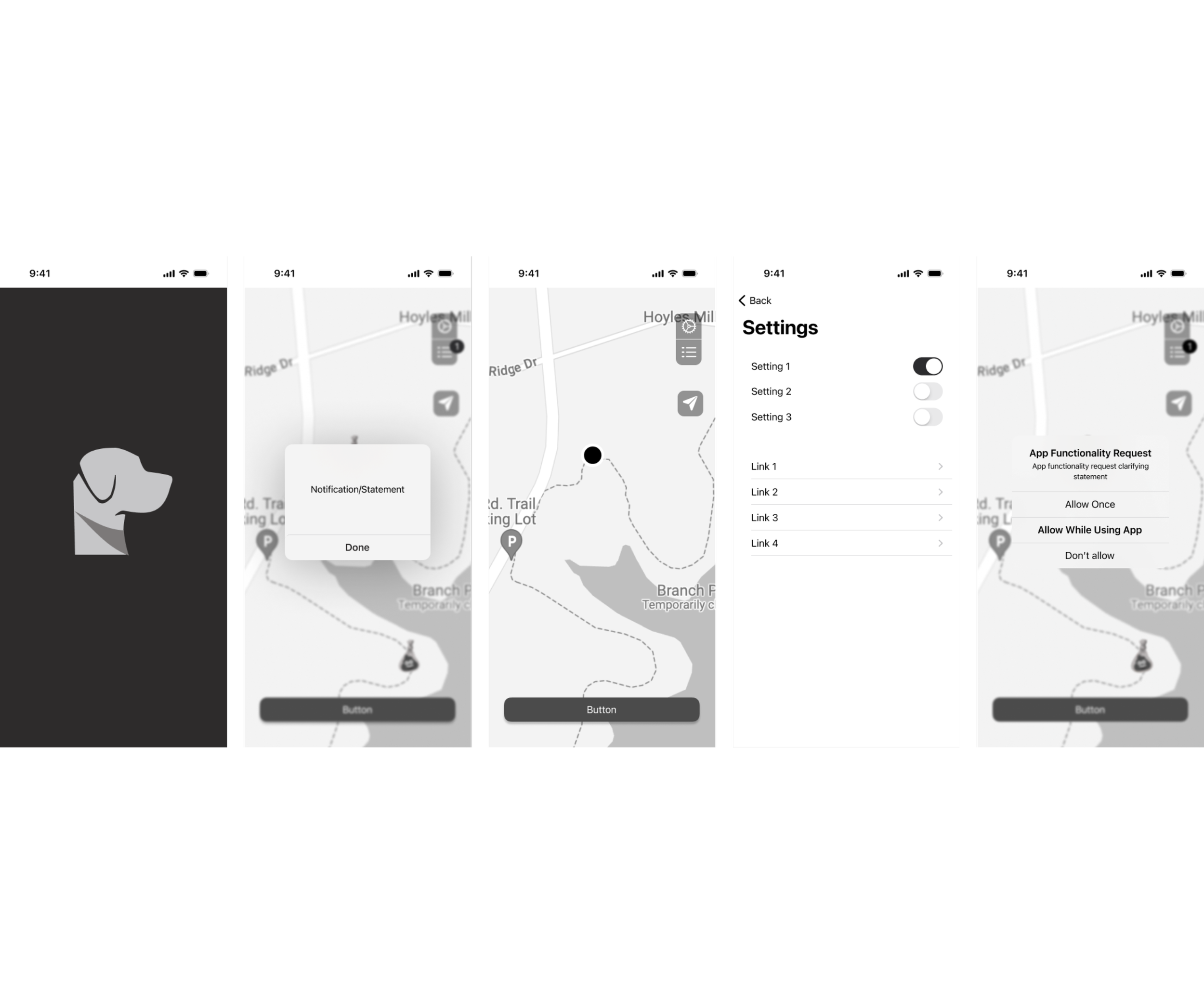
My low-fidelity wireframes were based on the initial user interviews, the information architecture, and the business’s branding. They each pointed to a simple and straightforward design anchored in Apple’s design resources, using minor touches to indicate the brand’s feel and organization. I returned to the low-fidelity wireframes throughout the design process to ensure that I didn’t lose sight of the site's primary feel and organization.
Low Fidelity Prototypes
Usability Testing
I created a fully functional, high-fidelity prototype of the primary flows and functions using Figma. Due to budget and time constraints, I chose a high-fidelity prototype. This also allowed me to simulate the most accurate representation of the final product's visual design and functionality, providing better testing and more detailed feedback.
Simultaneously, I started recruiting subjects for the test who fit our criteria. I did five usability tests in the first round and three after iterating on the issues that were identified:
Issues
Two testers got lost when trying to find the app settings
Two testers misclicked, and one got lost when asked to drop a bag
Three testers misclicked when asked to find the list of all bags currently dropped
Solution
I created an onboarding flow that shows where everything is and added it to the settings page so users can return to it if needed.
UI Design
Once the usability issues were resolved, I designed the final screens in Figma. My goal was to create a visual identity that aligned with the brand’s values and message to encourage a more enjoyable time in nature.
I followed a minimalistic, playful, and subtle design style
As this app is only created for iPhones at this point, I strictly followed the iOS Styleguide
Designed to make the functions easy and to encourage the user to have a more enjoyable time in nature (ie, minimal time spent looking at their phone)
Map View of Dropped Bags
Next Steps
01
Once the app is available to beta testers, I’ll follow up with at least five interviews to better understand real user’s experiences.
02
I’ll use interview information to discuss current design improvements with the stakeholder.
03
By referencing user feedback, I’ll discuss additional feature options that best serve the users and continue working with the stakeholder to improve the app.
Learnings
A deeper understanding of balancing user wants and needs with stakeholder expectations, wants, and needs.
I improved my communication skills when discussing the reasoning behind design choices.
I am more fluent in the skills needed to create logos in Figma, including union selection tools and masks.


